
How the MetroCard became an icon of design
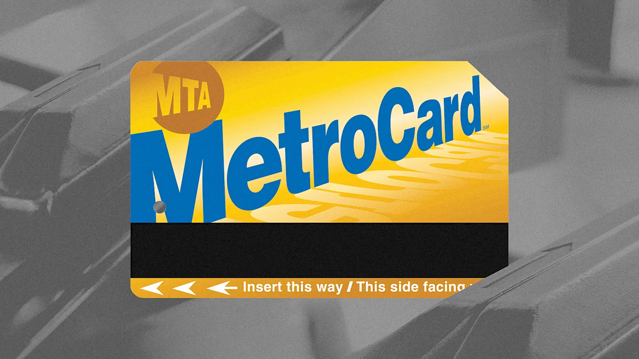
With its goofy block lettering and bright colors, the MetroCard feels like a relic, which it sort of is—an early 1990s design, complete with gradients and drop shadows, that’s managed to stick around long enough to become one of New York’s defining symbols. At a time when generic minimalism and the sheen of AI-generated graphics have taken over, its unmistakable graphics feel refreshing. And the fact that a 31-year-old fare payment system is still in circulation when most tech today becomes obsolete in a matter of months is a remarkable achievement. But the end is near: on December 31st, the MTA will stop selling MetroCards and completely phase them out on an imminent date that the agency has yet to announce. Loving tributes have already begun as the city pays its respects to the slim piece of plastic that kept commuters moving for three decades. “It’s not as iconic as the token, but maybe in the future it will be,” says Jodi Shapiro, curator of the New York City Transit Museum, which on December 17 opened “FAREwell, Metrocard,” a new exhibition on the card’s history.While it might be New York City Transit’s second-most famous fare payment system, it has had a tremendous effect on the metropolis’s culture, how people get around, and what good municipal design ought to accomplish. It all began with a big ask: getting New Yorkers to change their habits.Peter Stangl (MTA Chairman from 1991–1995) swipes a brand-new MetroCard through a turnstile, 1994. (Photo: New York Transit Museum)A generational shiftFor 40 years before the MetroCard, New Yorkers paid for the subway using tokens. Dropping it into a turnstile wasn’t much different than paying with coins. The MetroCard was a technical leap that changed how riders experienced the public transit system.“At the time of its introduction, not many people used swipe cards,” Shapiro explains. “If you were familiar with them, you probably worked some kind of job where there was a security measure.” (Photo: Stephen Chernin/Getty Images)The idea to replace tokens percolated in the late 1970s, when city council member Carol Bellamy proposed the idea. But it took until the 1980s for the MTA to take fare cards seriously.Richard Ravitch, the chairman at the time, wanted to update the system and keep it on par with Washington D.C., San Francisco, and Paris, which already adopted magnetic strip cards. He argued that it would encourage off-peak ridership, curb fare evasion, and allow the sale of monthly passes. “’Passes will encourage mobility,” Ravitch said, and “enhanced mobility will increase commercial activity in this region.” The MTA launched the MetroCard in January 1994 and existed side-by-side with tokens for nearly a decade. With the change to a fare card also came a change to the turnstiles. To riders, the subway’s built environment doesn’t change all that much, but when it does, it’s big—the Vignelli/Noorda signage, demolishing the El lines, the fare evasion spikes and fins. The MetroCard was responsible for a major physical shift: electrified turnstiles, which were required to power the magnetic strip readers, and with them electrified emergency exit gates that can be remotely opened by booth clerks.The ’90s are callingNow back to the MetroCard itself. With a blue gradient background, MetroCard spelled out in golden block letters that ascend in angle and descend in size from the bottom right to top left corner, the card is 1990s to the core. The decade was a highly experimental time for graphic designers because of the freedom desktop publishing, a relatively new tool at the time, gave them. With typography in particular, designers obliterated the rules. They set type on curves, stretched and warped letterforms, and layered text. (Photo: New York Transit Museum)Cubic Transportation Systems designed the magnetic strip and the turnstile readers, but the exact designers of the graphics are unknown. The most Shapiro has been able to concretely find is that a group of people within the MTA was responsible for the visual direction. Compared to the disciplined Helvetica wayfinding signage throughout the system, the MetroCard was pure pop, especially after the MetroCard Gold replaced the original in 1997. What is MetroCard?, 1993. (Photo: New York Transit Museum Collection)“It wasn’t just a cosmetic change,” Shapiro says. “It indicated visually that the magnetic strip was functionally different.” Magnetic strip technology improved in the first few years after the original card debuted and more information could be encoded onto it. The new cards enabled free transfers between buses and the subway and also let the MTA sell 7-day and 30-day unlimited passes. (The new magnetic strips also gave rise to green and white student passes and gold and white reduced-fare cards for seniors and people with disabilities.)For this iteration of the MetroCard, the agency reversed the colors—blue lettering on a gold gradient background—and added a drop shadow to the text. The MTA logo in the top corner switched to gold, too, giving the image a faint resemblance to a sunset. The Cardvaark, proposed mascot for MetroCard, 1993. (Photo: New York Transit Museum Collection)The MetroCard’s graphics were friendly and, like the genius of the Antenna-designed MetroCard machine, taught riders how to use it. (There was even a plan to have an affable MetroCard mascot named the Cardvaark to boost early adoption.) You can only swipe it in one direction and so the text orientation indicates which side should go up and the slanted lettering mimics the swiping motion. That clipped top-right corner? It’s an accessibility cue to let riders with low vision know how to orient the card through the reader.(Photo: Kyeema Mizell/Adobe Stock)Human-centered designAbout that swipe: It’s a motion that requires just the right speed: not too fast, not too slow, just brisk enough much to the annoyance and exasperation of tourists as well as daily riders who don’t want to look like newbies. (The exact speed should be between 10 and 40 inches per second.) “The cool thing about the MetroCard is the swipe mechanism is human powered,” Shapiro says. SubTalk: Refill your MetroCard, 2004 (Image: New York Transit Museum Collection)Relying on the manual labor of riders had ripple effects, like traffic jams at turnstiles, but on the whole it’s a lot simpler than the alternative: a conventional magnetic ticket reader, which mechanically draws a card in, reads it, and spits it out. The machine could jam at any of those three steps, which is risky given the volume of straphangers in New York. Over 4.6 million people ride the subway each day, which means that a single turnstile can clock thousands of swipes a day; in 2011 the busiest turnstile saw over a million riders pass through. “How many points of failure do you really want to have with a system that has that amount of transactions?” Shapiro says. “And the answer is you want to have as few points of failure as possible. When you have a human-powered card reader, that’s only really one point of failure.” In the calculus of subway math, lost time and expense of fixing a jam is worth a lot more than personal embarrassment. (Just ask Hillary Clinton and George Pataki.)(Photo: Brandon Klein/Adobe Stock)From to fare passes to holy grailsWhile the MetroCard’s front gave it its identity and functionality, its back turned it into a collector’s item. This was by design from the beginning, too. The graphics enticed people to buy and use them and offered an advertising opportunity. The MTA described them as “walking billboards.” MetroCards are printed using flexography and CMYK color, a process that results in crisp, vivid imagery and a high level of customization. “Since tokens were a big souvenir for people’s trips to New York, then why wouldn’t the Metro Card be one?” Shapiro says. The MTA launched the MetroCard with four collectible fixed value cards—$1.25 (a single-ride fare at the time), $5, $10, and $20. Each denomination featured a different scenic view of New York on the back: Grand Central Terminal, the World Financial Center, Times Square, and the skyline.First limited edition MetroCards, 1994 (Photo: New York Transit Museum Collection)Through the years, the MTA issued many more special-edition MetroCard that celebrated the city and its culture, over 400 in all. The Transit Museum has “several thousand” MetroCards in its collection and just a fraction of them are in the exhibition. They’re grouped thematically based on recurring motifs including sports teams, musicians, artists, PSAs and safety ads, commemorative moments, and transit facts. “There was definitely some fun being had,” Shapiro says. The first five years alone featured the New York Rangers winning the Stanley Cup, an illustration of subway riders by the Brooklyn-born artist James Rizzi, and an ad for Gang Starr’s album Moment of Truth—the first time rap artists appeared on the card. “Gang Starr is great,” Shapiro says, “but one of their members is from Boston so I can’t forgive that.” In 2012, the MTA changed the MetroCard rules to allow special graphics on the front amid a wider expansion of advertising in the system. (Before then, the MTA issued a MetroCard with a green logo in honor of climate week.) The Brooklyn Museum took advantage of this to publicize its David Bowie exhibition in 2018 as did Instagram with its content creators campaign from 2024, the very last limited-edition MetroCards printed. (Images: New York Transit Museum)The MTA’s collector’s item strategy worked. After the Supreme card launched to hordes of Hypebeasts rushing to vending machines (the NYPD had to barricade the lines and limit buyers to two cards apiece), resellers listed the limited-edition MetroCards for upwards of $1,000 (you can find them on the secondary market in the double digit range now). And some holdouts are still hoping their Biggie cards will fetch $5,000. But the rarest, according to Shapiro, is actually a special prepaid New York Times MetroCard mailed to newspaper subscribers in 1994. “You couldn’t buy it from a booth or anything like that,” she says. One is listed on eBay for $950. “It’s interesting to see something that is such a fundamental part of every New Yorker’s commute becomes some kind of grail on the secondary market,” Shapiro says. “It’s odd.” While Shapiro doesn’t personally collect MetroCards, she has held onto a select few, including Barbara Kruger’s designs released for the 2017 edition of Performa, the James Rizzi illustrations, and ads from defunct businesses like Kozmo and Urban Fetch.Compared to the MTA’s annual operating budget, around $20 billion, the revenue it earned from MetroCard campaigns is anemic. From 2012 to 2018, the MTA averaged about $600,000 a year in ad revenue. It rose to $1 million in 2019 then dropped to zero during 2020 on account of the pandemic, then ticked up to $166,000 per year between 2021 and 2023. In 2024, promos earned $641,000.Cultural touchstonesMore than being trophies for transit nerds, the MetroCard simply became part of the fabric of the city—literally. Ana Ratner, the editor of The Other Almanac and a lifelong New Yorker, recalls how she and her friends used to gather spent cards (broken boxes where riders discarded spent cards were jackpots) and make clothes out of them. “I wasn’t that good at it, so I did square things like wallets and tote bags, but then friends of mine could make dresses and those are really cool,” Ratner says. “You would punch holes in different parts of the MetroCard, link them with metal loops or wire or string, and then you’d have the chain tunic dress.” Teen Vogue even featured one of her friends with a MetroCard-wrapped desk in its Last Look column. “She was extremely crafty,” Ratner adds.Juan Carlos Pinto, an artist based in Brooklyn, has been making collages out of MetroCards since 2002, using the ads on the back to bring color to his mostly blue, gold, and yellow compositions. “Of course I will miss the card,” he says. “It became my bread and butter. But the switch to other forms of payment is unavoidable. Change is good.”
Numerous other artists have used the card as material, too. The Transit Museum’s next MetroCard show, opening in March, will chronicle it as an artistic medium. On the conceptual side, Shawn Lawrence James, aka The Blue Hundreds, a 40-year-old artist born and raised in Bed-Stuy, wrote a song in 2015 about the MetroCard that was featured in an exhibition at MoMA PS1. In it, he describes a glitch within two-trip tickets (bending the card just right lets riders swipe in for free, a trick he learned 20 years ago) against a backdrop of rising transit costs and increased policing of fare beaters. He saw the song as a way to help people save money, stay out of trouble, and offer “access on your own terms,” James says. “The song was kind of like a protest.” As the MTA phases out the MetroCard this graphic ephemera and the culture around it will slowly fade away. When tap-to-pay through OMNY fully takes over, many riders will never need a dedicated physical object to ride New York City transit, a first in over 160 years.“Since transportation started in New York City in the 1860s, you’ve always either had to have a ticket or a token,” Shapiro says, noting that tokens existed and were in use before the subway opened. “It’s going to be weird to not have everyone using something tangible.” With the MetroCard’s retirement comes another casualty of dematerialization (remember ticket stubs, loyalty cards, and handwritten correspondence?) and another retreat into the digital wallets trapped in our phone screens. As the MetroCard exits daily circulation, we also lose the collective experience it embodied. On any given day, thousands—maybe even millions—of New Yorkers carried the same exact object, with the same messages printed on them. The MetroCard is a link to a specific place and time: a PSA about the dangers of subway surfing, a fact about the most checked-out book in the NYPL system (that would be The Snowy Day by Jack Keats), or a simple poem. When the MTA released the Biggie cards, in honor of what would have been his 50th birthday, fans lined up for hours for the chance to buy one. “Who’s not going to want this, being born and raised in Brooklyn?” a woman from Brighton Beach told the New York Post. (Image: New York Transit Museum)Presumably, the MTA could offer limited-edition OMNY cards, but since their expiration date, usually five years after issuance, is longer than the MetroCard and its cost, $5 each, is also higher, there’s less incentive to switch up the graphics. A spokesperson from the MTA says that “moving to a contactless payment unlocks potential for new customer-friendly promotions and fare discounts” and mentioned a Barilla activation that turned pasta boxes with an OMNY decal stuck on them into a one-way ticket. Has anyone collected these?I, for one, haven’t swiped my MetroCard in nearly a year (it expired on January 31, 2025) since contactless payments are so much more convenient, but the scuffed up card with a PSA about not going on the tracks for any reason remains in my wallet, and likely will for quite sometime as a tribute to the legendary object. (a)The extended deadline for Fast Company’s World Changing Ideas Awards is Friday, December 19, at 11:59 p.m. PT. Apply today.
Publicado: 2025-12-22 14:30:00
fonte: www.fastcompany.com


